
Objective:
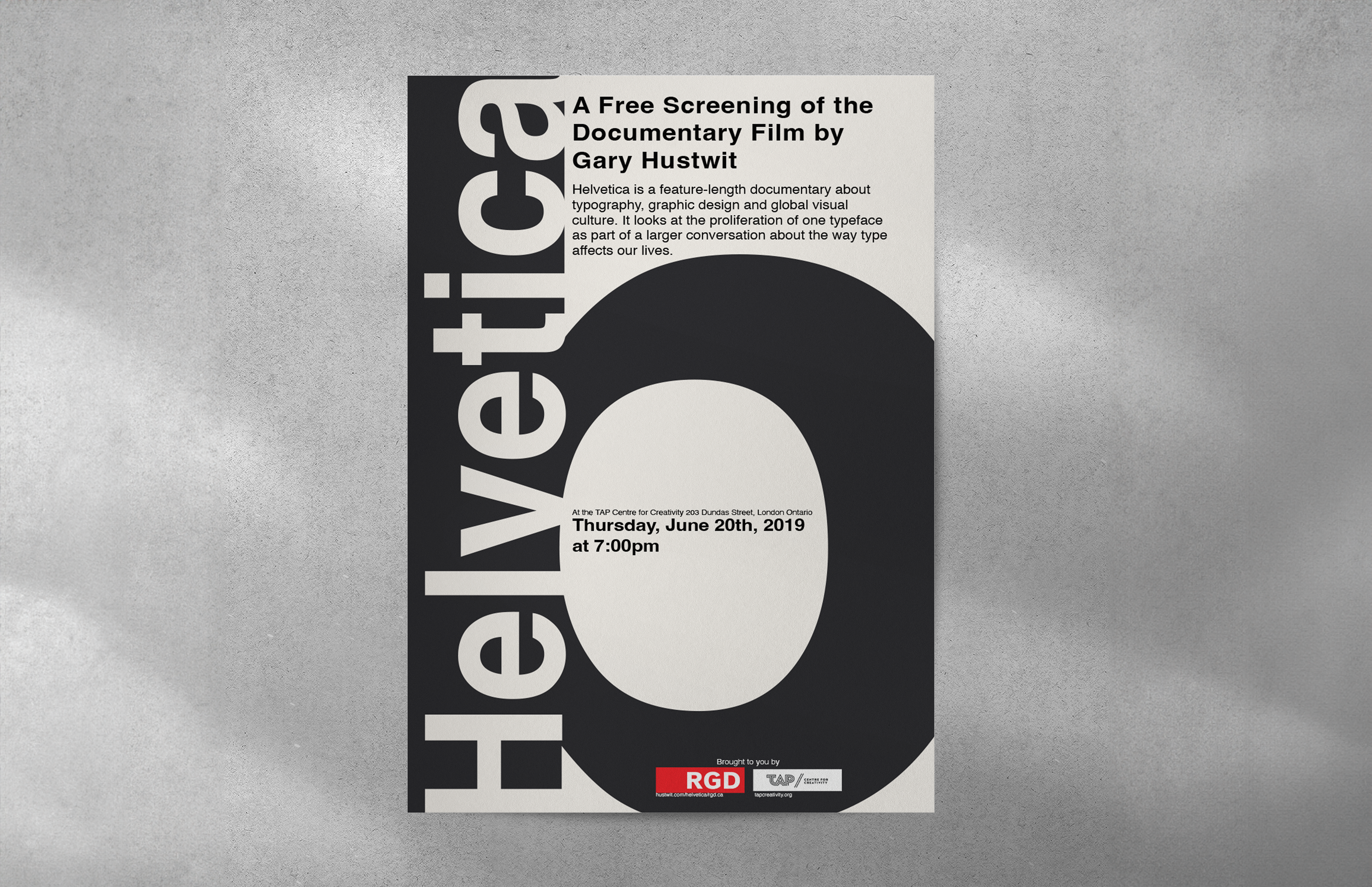
The objective of this project was to design a promotional poster to promote the Gary Hustwit documentary film about the Helvetica typeface using only typography.
Process:
I am a big fan of the Helvetica typeface, so this project was exciting, and I knew that I wanted to play with positive and negative space. The finished result displays the importance of hierarchy and balance.
Mediums/Tools Used:
Illustrator for line art, Photoshop for poster design and mockup